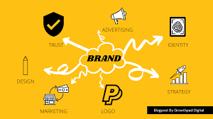
Your logo is often the first thing people notice about your business. It appears on your business cards, signage, letterheads, envelopes, corporate shirts, website, social media, and more. A great logo builds recognition, trust, and professionalism.
At Popote Printers, we've designed hundreds of logos for Kenyan businesses. Here's what we've learned about creating memorable logos.
What Makes a Great Logo?
A great logo is:
- Simple: Easy to recognize and remember
- Memorable: Sticks in people's minds
- Timeless: Works for years, not just for current trends
- Versatile: Looks good on everything from a business card to a large banner
- Appropriate: Fits your industry and brand personality
"A logo doesn't need to say what you do. It needs to identify who you are." — Paul Rand
Types of Logos
1. Wordmark (Logotype)
A wordmark uses only text — typically the company name in a distinctive font. Examples: Google, Coca-Cola, FedEx.
Best for: Businesses with unique, memorable names. Works well on business cards and letterheads.
2. Lettermark (Monogram)
A lettermark uses initials rather than the full name. Examples: IBM, CNN, HBO.
Best for: Businesses with long names. Clean and compact for small spaces.
3. Iconic (Symbol)
An icon or symbol represents the brand without text. Examples: Apple's apple, Nike's swoosh, Twitter's bird.
Best for: Established brands with high recognition. Requires significant brand awareness to work alone.
4. Combination Mark
A combination of text and an icon. This is the most common and versatile logo type. Examples: Adidas, McDonald's, Burger King.
Best for: Most businesses. The icon can be used alone once recognized.
5. Emblem
Text inside a symbol or shape. Examples: Starbucks, Harley-Davidson, university crests.
Best for: Traditional, established, or institutional brands.
💡 Pro Tip
For most Kenyan small businesses, a combination mark or wordmark works best. It clearly communicates your name while building visual recognition.
Logo Design Tips for Kenyan Businesses
1. Keep It Simple
The most memorable logos are simple. Think of the Nike swoosh or Apple's apple. Avoid complex illustrations, too many colors, or intricate details that won't reproduce well at small sizes.
2. Make It Scalable
Your logo will appear in many sizes — from a small business card to a large banner or 3D signage. Ensure your logo looks good at any size.
3. Choose Colors Wisely
Colors evoke emotions and communicate brand personality:
- Red: Energy, passion, excitement
- Blue: Trust, professionalism, calm
- Green: Growth, nature, health
- Yellow: Optimism, warmth, attention
- Orange: Creativity, enthusiasm (like Popote Printers!)
- Purple: Luxury, wisdom, creativity
- Black: Sophistication, power, elegance
Choose 2-3 colors max. Ensure good contrast for readability.
4. Use Appropriate Typography
Font choice matters. A law firm shouldn't use a playful, handwritten font. A children's toy store shouldn't use a formal, rigid font.
Customize fonts when possible — unique lettering makes your logo more distinctive.
5. Ensure Versatility
Your logo should work in multiple formats:
- Full color on white background
- White on dark background
- Black and white (for invoice books or faxes)
- Vertical and horizontal versions for different spaces
6. Make It Timeless
Avoid trendy design elements that will look dated in a few years. Aim for a logo that will serve your business for a decade or more.
7. Get Professional Help
While DIY logo makers are tempting, professional logo design is worth the investment. A professional designer considers all the factors above and delivers usable files in multiple formats.
At Popote Printers, we offer professional logo design services as part of our comprehensive branding packages.
Where Your Logo Appears
Before finalizing your logo, consider where it will be used:
- Business cards — Often the first impression
- Letterheads and envelopes — Professional correspondence
- Office signage and 3D lettering — Physical location branding
- Corporate shirts and caps — Team apparel
- Vehicle branding — Mobile advertising
- Product packaging — Branded boxes and labels
- Promotional mugs and gifts — Customer giveaways
- Website and social media — Digital presence
Common Logo Design Mistakes to Avoid
❌ Too Complex
Intricate details get lost when reproduced small. Simple is better.
❌ Relying on Trends
Today's hot trend is tomorrow's dated design. Aim for timeless.
❌ Using Clip Art
Your logo should be unique. Clip art looks unprofessional and may have copyright issues.
❌ Poor Font Choice
Hard-to-read fonts or overused fonts (like Comic Sans or Papyrus) undermine professionalism.
❌ Too Many Colors
More colors mean higher printing costs and less versatility. Stick to 2-3 colors.
❌ Not Testing Before Finalizing
Print your logo at small and large sizes. Test it on different backgrounds. Get feedback from others.
What to Expect from Professional Logo Design
When you work with Popote Printers for logo design, you'll receive:
- Multiple initial concepts to choose from
- Revisions based on your feedback
- Final files in multiple formats (PNG, JPG, PDF, AI, EPS)
- Color specifications (CMYK for print, RGB for digital)
- Black/white and reverse-color versions
- Horizontal and vertical layouts
Ready to Create Your Logo?
Your logo is a critical investment in your brand's future. Don't settle for a generic, forgettable design. Work with professionals who understand branding and can create a logo that truly represents your business.
🎨 Ready to Design Your Logo?
Contact Popote Printers today for professional logo design services. Let's create a memorable brand identity that sets you apart.